Logos and Eras of Drayton Manor

Kam

Member
Drayton Manor has existed for nearing 70 years and it's unsurprising to learn that it has had many logos during its years. But it's logos in many ways; as with many companies, reflect on a particular time and era that we can look back on. Does seeing a past logo of Drayton Manor bring back a good time in your life? And more importantly, do you have a favourite era/year of Drayton Manor?

Let's start with a logo that the park used in the 80s, which was a time when the park expanded at a faster rate than it ever had before. Do you miss it, or do you wish you'd seen Drayton Manor in the 80s with your own eyes?
395
 
Last edited:
I really saw the start of the park going from a amusement/funfair to a full on theme park.
In the 80s they really only had the jungle cruise and the log flume as the only themed rides in the park.
 
This is by far my second favourite Drayton Manor logo (with my favourite being the current one)! It goes to show how for a small amount of time the Pirates Cove area was in a way the main attraction of the park before Shockwave and Splash Canyon!
 
  • Like
Reactions: Dan
AvalancheAttractionsUK, you're completely right! Pirate Cove was a big pull for the park, they had Pirate Adventure, Jolly Buccaneer, Dodgems and Jolly Roger - it was a really successful area. I think they went in with the logo being based on Pirates given the opening of Pirate Adventure, the park really tried to emphasise that there was nothing like this in the UK - which there wasn't and still isn't.

It's a lovely logo and it is great that it has some direct relation to something within the park, as the current one does with the Shockwave loop. What I do find interesting is the fact that the logo remained the same into 1995, it did not change when Splash Canyon and Shockwave opened in 1993 and 1994 respectively.

Personally, this is my favourite logo, mainly because it reflects what is going on within the park, and shows that the park has themed areas - which was becoming a big thing for Drayton Manor at this point in time. Although, I am very fond of the current logo and hope it sticks around.
 
This is by far my second favourite Drayton Manor logo (with my favourite being the current one)! It goes to show how for a small amount of time the Pirates Cove area was in a way the main attraction of the park before Shockwave and Splash Canyon!
It absolutely was. And as Dan points out, it was still used for a couple of years after the Shockwave / Splash Canyon double project too. It fitted rather comfortably in to everything Drayton wanted to market themselves as; a family theme park that go out of their way to entertain all guests across the board and create fantastic experiences. A dark ride of that size and scale was and still is extraordinarily rare for a British theme park. It's only fair to say that Drayton Manor started to become a 'theme park' (in the true sense of the word) after July 1990!
 
  • Like
Reactions: Dan
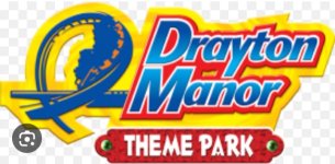
Next up, my personal favorite era ever for Drayton Manor, 1996-2003. The current park logo heavily inspires off the logo from this era; and for good reason. It saw the park become a big name on the UK map, and highlights Shockwave, which remains the signature ride at the park, and is an incredibly unique coaster. The park had numerous well themed areas, with a Wild West Industrial themed action park: Klondike, Shockwave, Splash Canyon, Black Revolver, Teacups and the Log Flume all gelling together. Fisherman's wharf appeared as a superbly original area taking off a Cornish seaside town and sitting perfectly next to the lake. Maelstrom and Stormforce 10 complimented this area perfectly. Here's a summary of major changes:
625
 

Attachments

  • 1554924106610.png
    1554924106610.png
    869.9 KB · Views: 377
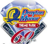
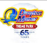
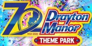
It then changed to a logo like the 2000 version but better they changed the logos for every anniversary they had. Then in 2022 the park announced a rebrand and made the current logo(the worst logo in my opinion)
 

Attachments

  • Screenshot_20230628_220439_Google.jpg
    Screenshot_20230628_220439_Google.jpg
    89.4 KB · Views: 165
  • Screenshot_20230628_220454_Google.jpg
    Screenshot_20230628_220454_Google.jpg
    131.7 KB · Views: 155
  • Screenshot_20230628_220511_Google.jpg
    Screenshot_20230628_220511_Google.jpg
    98.7 KB · Views: 155
  • Screenshot_20230628_220446_Google.jpg
    Screenshot_20230628_220446_Google.jpg
    85.5 KB · Views: 160
  • Screenshot_20230628_220602_Google.jpg
    Screenshot_20230628_220602_Google.jpg
    27.6 KB · Views: 159
It then changed to a logo like the 2000 version but better they changed the logos for every anniversary they had. Then in 2022 the park announced a rebrand and made the current logo(the worst logo in my opinion)
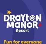
I like the new logo because it looks simplistic while still catching the feel the park are going for, 'fun for everyone'.
 
I wasn't a fan at first like everyone else, but definitely fits the park now. Looks so good on park also in different areas.
 
And the DraytonTalk award for "the most Zen post of the year" goes too......(drum roll)
Haha, guess you're right looking back at my post! Though still, the new logo is horrendous for a Theme Park. The previous one looked like it was done to a professional standard and the designer took time. The new one looks like it was done by a 5 year old who doodled it, no offence Drayton.
 
Haha, guess you're right looking back at my post! Though still, the new logo is horrendous for a Theme Park. The previous one looked like it was done to a professional standard and the designer took time. The new one looks like it was done by a 5 year old who doodled it, no offence Drayton.
It does I agree with you on that it looks to cartooniy the old one was a master piece while this one well erm........ Absolutely awful from the front to the main logo itself they could of just kept the old one and changed it to resort instead of theme park
 
It does I agree with you on that it looks to cartooniy the old one was a master piece while this one well erm........ Absolutely awful from the front to the main logo itself they could of just kept the old one and changed it to resort instead of theme park
While they could've just changed it to resort, I think they just thought since they were changing the logo anyways they may as well get a new one entirely. Plus, Drayton Manor Theme Park had a pretty bad name for itself before Adventure Cove as there was the Splash Canyon accident, GForce getting stuck on the lift hill and old rides being removed with nothing new coming in to replace them.
 
Back
Top