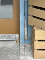
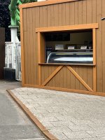
It seems the multi-buy offer on Brown Paint was far too tempting.
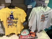
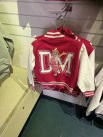
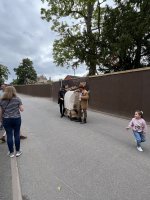
Drayton have done a brilliant job re-theming the former Cartoon Network Street, which is looking incredible.
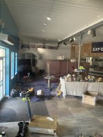
It’s a terrible shame that such a poor job has been done on Accelerator. An already dark queue line has been painted over in dark brown and looks incredibly unimaginative. The paint is already marked and peeling; it seems so boring in comparison to the amazing work done over the street.
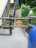
I completely understand that Accelerator’s re-theme is a work in progress, but I’m concerned by the initial stages of this. Brown and Chrome doesn’t look great on the exterior of the building, dark corridors painted even darker brown doesn’t work well, and the sci-fi theming inside of the building from Ben 10 / Accelerator remains — will they just paint over this in brown too?
If the green track is to be embraced, it’d be great to see this jet-washed. It is filthy.
